Design guidelines for mobility stations in Wolfsburg

Mobility strategy

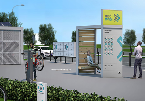
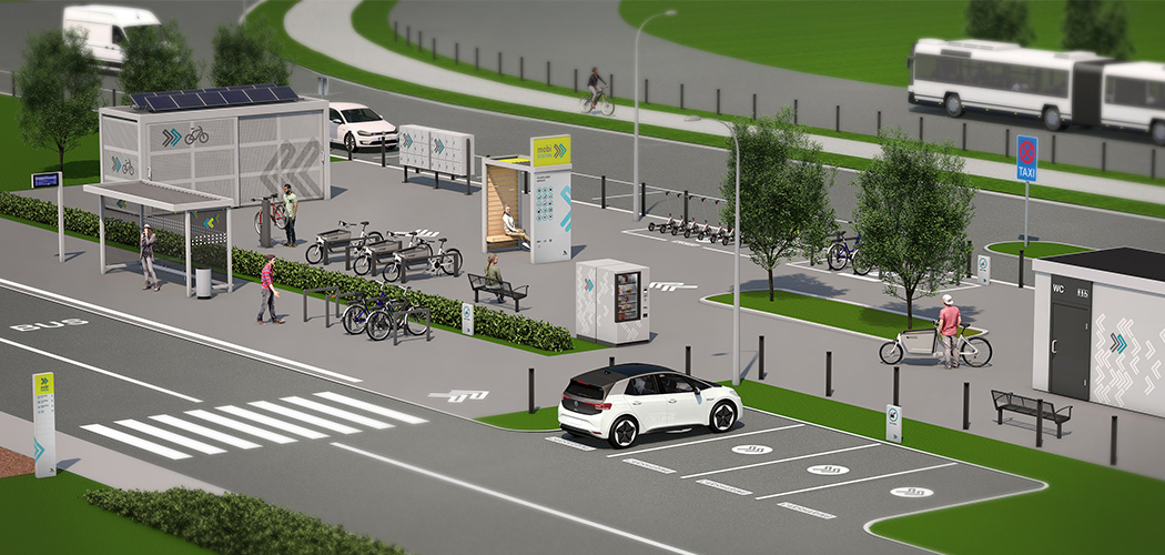
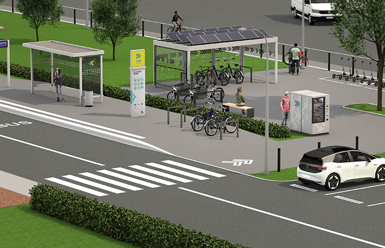
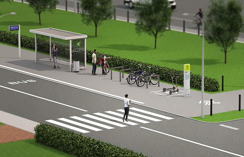
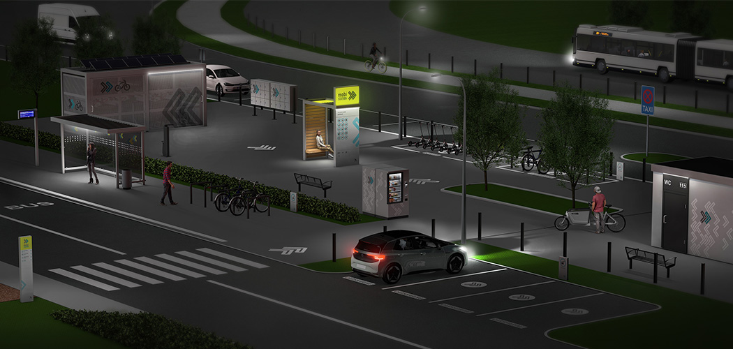
As part of the mobility strategy adopted in October 2020, the city of Wolfsburg is pursuing the goal of strengthening sustainable forms of mobility. A central element of this strategy are mobility stations, which bundle various services in one location and thus create attractive alternatives to private cars.

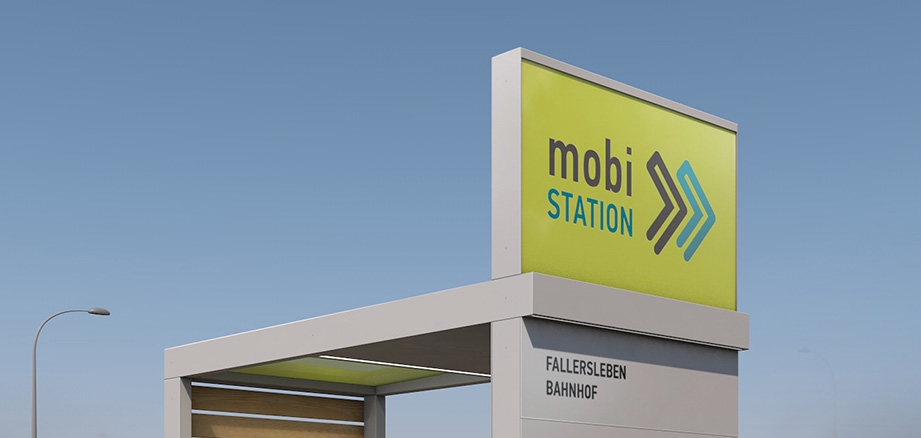
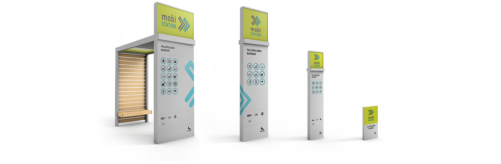
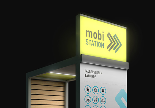
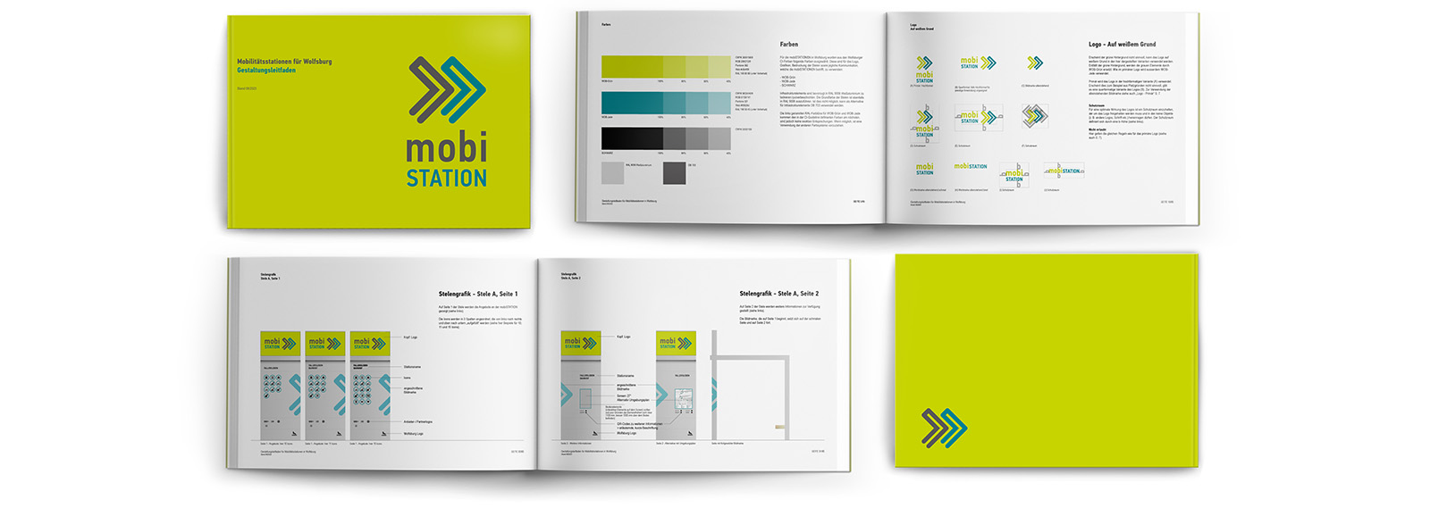
In order to increase the visibility, quality of stay and recognition value of these stations in the cityscape, a design guideline was developed. This ensures a consistent appearance through a flexible corporate design (CD) that not only makes the new mobility services visible, but also integrates them harmoniously into the urban environment.

The guideline defines key design elements such as brand name, logo, colors, typography and formats. In addition, their application to the structural components of the mobility stations is clearly demonstrated. The aim is to create a clear, accessible design with high recognizability that is modular in structure and can be used flexibly across locations.

Design

Each mobility station receives a logo, consisting of a distinctive image and a word mark. This visual identification mark creates identity and recognition. To clearly identify the various infrastructure elements, the logo – or a graphic structure developed from it – is used on the individual modules of the station. A central design element is the specially developed stele. It makes the station visible in public space, serves as a source of information and strengthens its recognition in the cityscape.

Development phases with project participants

The development of the design guidelines for the mobility stations began with a participatory workshop in which relevant stakeholders could contribute their perspectives and requirements. Based on the results of this exchange, the design concept was developed and gradually refined.

The design was developed and the design guidelines were created in several iteration phases. Feedback was continuously incorporated in order to achieve a practical and coherent result.

Logo development

A distinctive logo was developed using the terms “Mobi” and “Station” specified by the client. It is characterized by a striking and dynamic design and impresses with its versatility. Available in various colors, the logo works reliably in a wide variety of application contexts.

Modules – Stele family

The specially developed stele is a central element of every mobility station. It makes the station visible in the urban landscape, provides important information, and increases its recognition value. The stele was designed as a modular family in four different sizes. This allows it to be flexibly adapted to different locations and spatial conditions and can be used throughout the city — from central transfer points to smaller neighborhood locations.

Project visualization

The stations were visualized and presented as examples in three sizes: S, M and L. This makes the use of the steles, the logo and the underlying graphic structure clear and understandable.

Example station, size L

Example station, size L

Example station, size M

Example station, size S

Lighting concept stele

Lighting concept

Design guidelines

The result is a design guideline that describes the precise application and use of design elements, graphic structures, and structural modules. It serves as a binding basis for implementation and ensures a standardized appearance for mobility stations throughout the city.

Data

Client:Stadt Wolfsburg
Period:Design development 2022 – 2023